11tyCMS: Image uploads and design enhancements
posted on Jul 3, 2025
So it's been a little while! Nope, this project is NOT inactive! Just slow moving. Work and life has been taking its toll.
Since we last spoke, I've gotten on top of a few changes:
🖼️ Image uploads
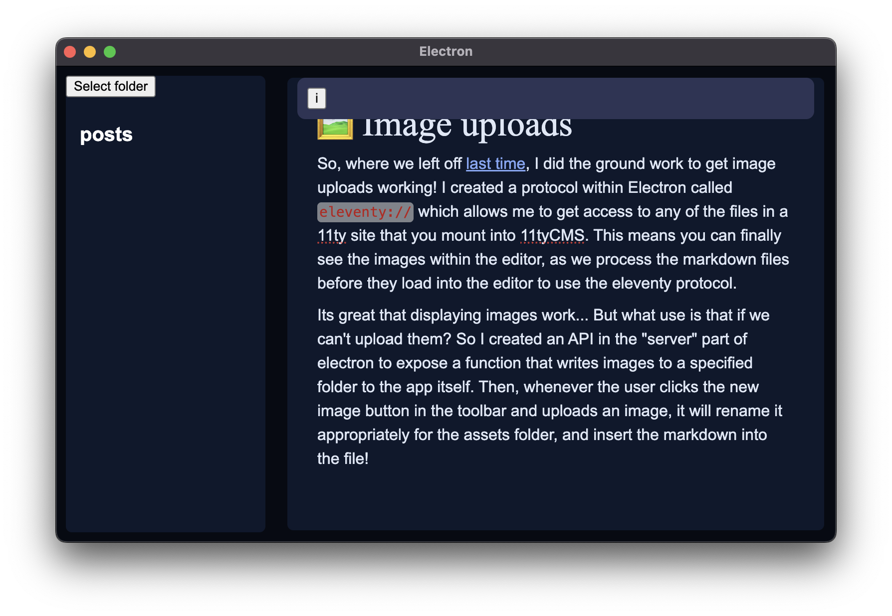
So, where we left off last time, I did the ground work to get image uploads working! I created a protocol within Electron called eleventy: // which allows me to get access to any of the files in a 11ty site that you mount into 11tyCMS. This means you can finally see the images within the editor, as we process the markdown files before they load into the editor to use the eleventy protocol.
Its great that displaying images work... But what use is that if we can't upload them? So I created an API in the "server" part of electron to expose a function that writes images to a specified folder to the app itself. Then, whenever the user clicks the new image button in the toolbar and uploads an image, it will rename it appropriately for the assets folder, and insert the markdown into the file!
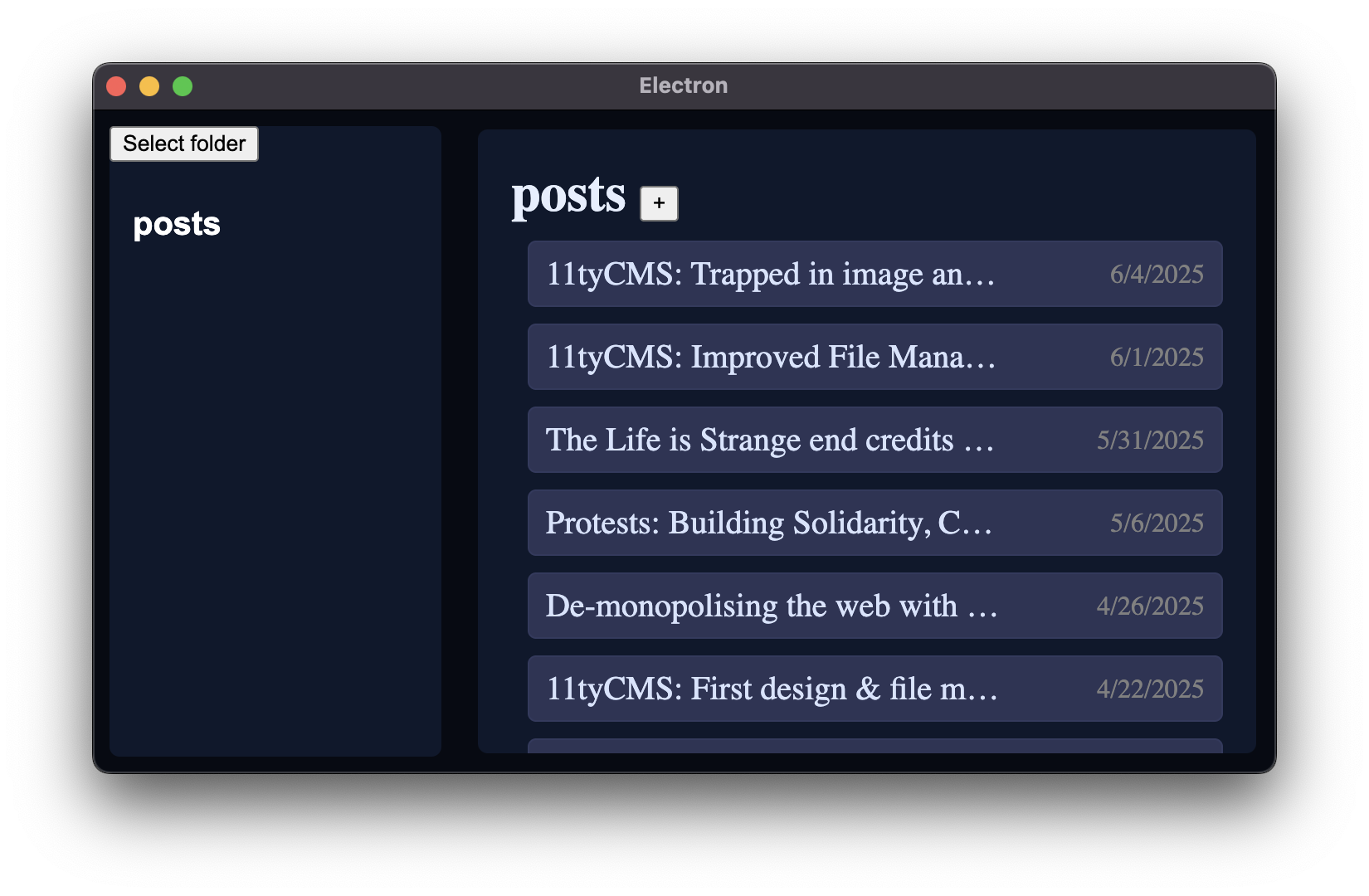
📋 Dates n' lists
Very small, barely noteworthy update here... But I finally got round to arranging posts by their dates and displaying the proper date on the right:
🧑🎨 Design enhancements
But it doesn't stop there, either! I wanted the design to look a little nicer, especially given the fact that I'm spending a lot more time in this app writing my blog posts. The phase that this project is in doesnt really call for big investments of time or energy to design and UX just yet (though these will be my priority in the near feature), I want to perfect the underlying functionality first. But that doesn't mean I can't have something nice to look at in the meantime.
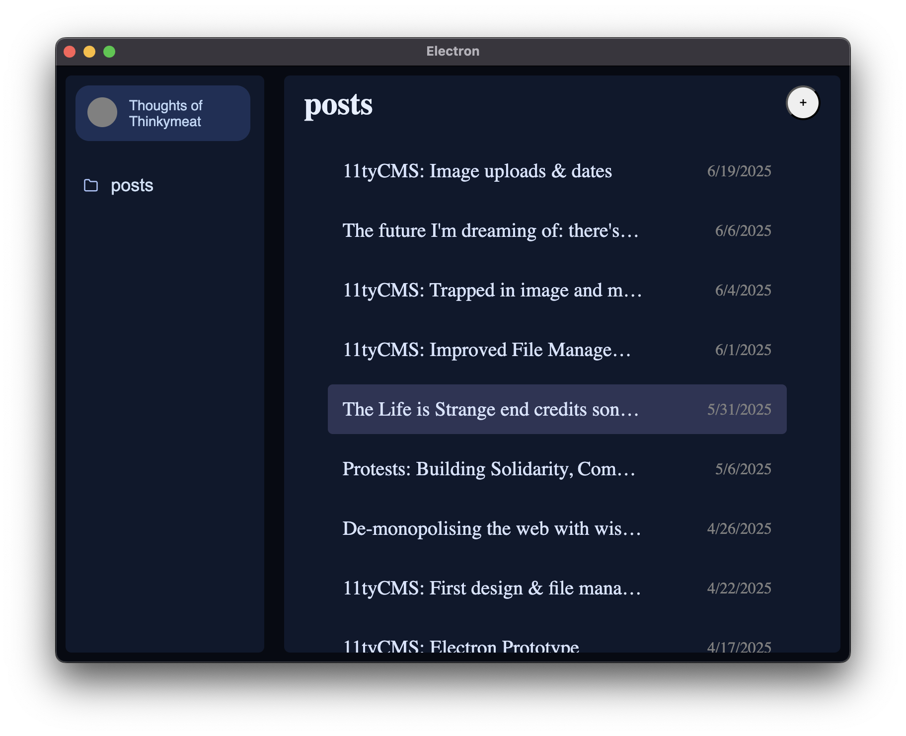
I present to you: the new sidebar and posts list!
Contrasting this to the previous screenshots, you can see some fairly subtle but worthwhile changes!
The sidebar
So at the very top, where the "select folder" button used to be, we have the new site info "pill". I really love this. At present, its all hardcoded at not functional. But, eventually, I'll have it go into the _data folder and read a site.json file to get the name of the website, it will then populate that gray circle with the favicon. This is perfect, because then anyone who's got their site open can see which one it is at a glance.
My next plan with this, once it's functional, is to make it so when you click on it, it leads you to a "site dashboard" kinda area. Here you'll be able to manage anything in the _data folder, and configure 11ty. Maybe have some cool stats in there and stuff about local database management (to save performance and make managing data easier, I'm hoping to have an 11tyCMS specific SQLite database with each site that can just help us keep track of files a little easier and faster.
Then we have the collection links. I've added additional padding to bring it in line with the site info pill, and added an icon for each collection. I've also changed the color of the text to be a little less white so it doesn't blind you. I'm really liking this look so far, it's starting to look like complete software! The only question I have is whether or not we highlight it in some way to make it obvious which collection you're in when you're in the editor... Really I want a design that is light weight, that isn't cluttered or busy, and I feel like that might go against my design philosophy.
Perhaps also, in the far future, I'll have functionality which will allow people to change the collection icons. Maybe you could have an emoji, or some other feather-icons icon. But this will be a pretty big pain in the ass, as I'd have to basically code an emoji picker of my own, which I don't want to do. Yes, I could use a library, I might be convinced to. But for now, this will be on the back burner.
Eventually, I plan to put a little button at the bottom of the sidebar which says: "Publish site", which will run 11ty and build any changes you've made. Eventually once I've coded the functionality for it, this will hopefully also upload all your files to your web server or wherever too!
There will also be a little status bar at the very bottom with a traffic light sort of system signifying the status of the 11ty server, whether its running or has any issues, and a button for the code area once we've implemented that. Definitely one for the terminal too.
The posts list
So, I've aligned the posts list area to have the same margin and padding as the sidebar. The header of the collection name in the posts list does align with the site info pill in the sidebar which is nice. And I've made the new post button circular and I've chucked it all the way to the right. I'm not 100% sold on circles in this design and I don't know how to color it yet, but for now this is serving better than before.
In the interest of reducing the "busyness" of the design, I've removed the background colors of each post in the list. The background on a post item will only appear once you've hovered your mouse over it, which causes it to fade in. The posts list also has a specific margin to put it beneath where the site info pill ends in the sidebar.
I've added some extra margin on the left and right to each post item too, I think this makes it a little nicer to look at and makes the post items look a little less spread out on larger resolutions, while also making it easier to associate the post titles with their respective dates to the right. This is especially important now that we don't have backgrounds on each one!
The editor
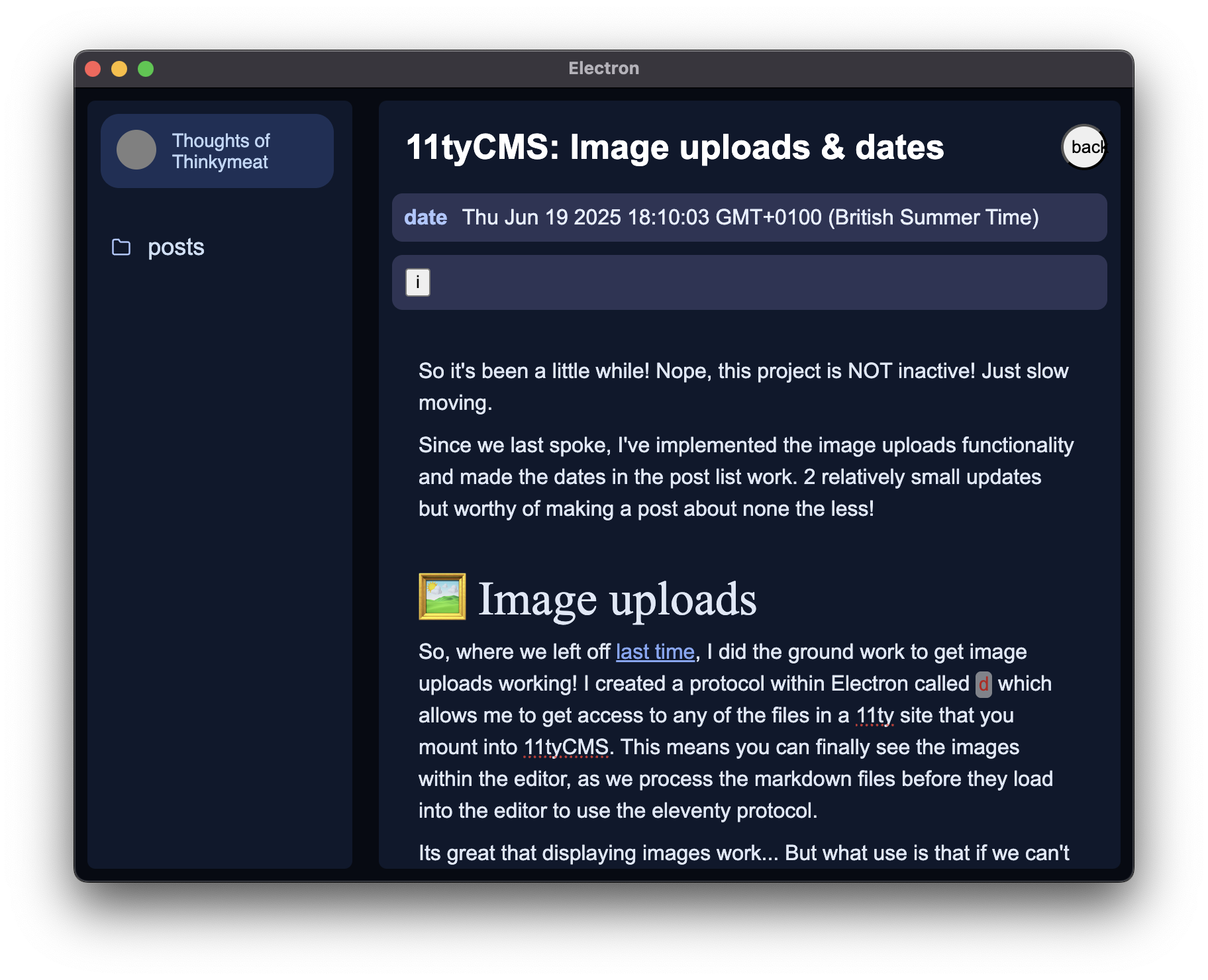
The editor is the bit with the least attention to design right now, and it'll probably remain that way for a while. But I've put a close button for the editor in the top right. I'm not sure how I feel about this being here, because once you press it, the add post button appears straight away as it leads you back to the posts list page. These buttons are also misaligned with each other, so I want to work to make it so they're in the same place at least, which will hopefully make the transition between both views a little less jarring. I feel like maybe, the back button should be to the left of the titlebar? But then I feel like the titlebar would be out of alignment? I'm not sure...
The header is also aligned with the site info pill, and the metadata area comes out beneath it on the y axis. I'm happy with that!
My next plan with the editor is to hopefully get the metadata working properly. Maybe improve the design of the metadata area a little. I also want to fix the editor content going behind the sticky editor bar too... Both should hopefully be fairly quick to get on top of.
Conclusion
So hopefully next tasks will be:
-
Improving the metadata area in the editor
- Adding functionality to add metadata.
-
Adding more options to the editor bar
-
Making the "site info" pill functional
-
Add a "publish site" button
We've got a lot to get done, but maybe once I've gotten to the "publish/build site" button, it'll be ready for a public FOSS alpha release? Who can say! But that's what I'm hoping for as the year goes on. First I want the functionality to be solid, and once it is, I'll release it to get feedback and bug reports.
This project will likely be a slow drip, as I have to work outside of this... Unless enough people like this that they want to fund it on Patreon or something 😂, in which case? I'd go full pelt into this project and make it premium AF. Who knows!
Anyway, thanks for reading and I'll keep y'all posted on the next steps :)
Over and out! xo